Hi there! Welcome to our A2 Media Studies blog. We created a music video to the pop genre song 'Running' by Naughty Boy featuring Beyonce and Arrow Benjamin. However, our artist was called Sienna Blossom. The video is primarily targeted towards females between the ages of 15 - 23. Additionally, we also created two ancillary products each. Below are the links for each product.
Running - Final Cut from Repertory Records on Vimeo.
In order to ensure that tasks were spread out evenly, we decided on "official" specific job roles so that we could all contribute rather than one person doing all of the work. However, we did share out the responsibilities to ensure that we all got a chance to explore different roles.
Officially:
Daniella: As director, I had the role of ensuring that everyone in the group worked together cohesively. I worked with both the cinematographer and the editor so that the best shots could be chosen and made sure that everyone had the same collective image when it came to what was being created.
Digipak: https://repertoryrecordstm.blogspot.co.uk/2018/02/digipak-final_25.html
Album poster: https://repertoryrecordstm.blogspot.co.uk/2018/02/album-poster-final_25.html
Sneha: As head-editor, I overlooked the editing for the production and made sure that the editing of each cut was as we had initially anticipated. I had the responsibility of ensuring that I also worked with the director and cinematographer to ensure that all aspects of the production would go as smooth as possible.
Digipak: https://repertoryrecordstm.blogspot.co.uk/2018/02/digipak-final-draft_25.html
Album poster: https://repertoryrecordstm.blogspot.co.uk/2018/02/album-poster-final-draft.html
Ritik: As the head cinematographer I was in charge of actually shooting the film. I had to work closely with my peers so that we could all formulate our ideas and visual styles into our production so that we all have a clear understanding as well as an objective that would captivate our target audience through the visual art.
Digipak: http://repertoryrecordstm.blogspot.co.uk/2018/02/digipak-final-draft_24.html
Website: https://valar014304.wixsite.com/siennablossom
Tuesday, 3 April 2018
Friday, 9 March 2018
Thursday, 8 March 2018
Monday, 26 February 2018

Sunday, 25 February 2018

Final cut production process
Below is a short screen recording of the editing process of the final cut.


Saturday, 24 February 2018


Friday, 23 February 2018

Tuesday, 20 February 2018


Sunday, 18 February 2018

Friday, 16 February 2018

Thursday, 15 February 2018


Album poster : Experimental
As a way of having a variety of visual possibilities I made a draft that offers an entirely different visual to previous drafts which heavily incorporates the brand. The final draft will not look like this but I wanted to experiment with the different ways our brand can appear.


Wednesday, 14 February 2018
Ancillary draft 4 feedback
Here, I gained feedback from my media teacher as well as media students. This enabled me to gain feedback on a more technical level. In the image below, in grey, I have added what I will do in response to the feedback received.

Tuesday, 13 February 2018
Album poster final draft feedback
Based on all the feedback I had gained, I made changes and created two final drafts. Here, I worked specifically on reducing the appearance of the cut line at the bottom of the image of the artist. Option 1 was a simple fade and option 2 was a line of the twitched flower alternating colours. My target audience seemed to prefer the second option with the flowers therefore I decided to make that my final draft.

 |
| Option 1 |
 |
| Option 2 |

Monday, 12 February 2018
Album Poster draft 4
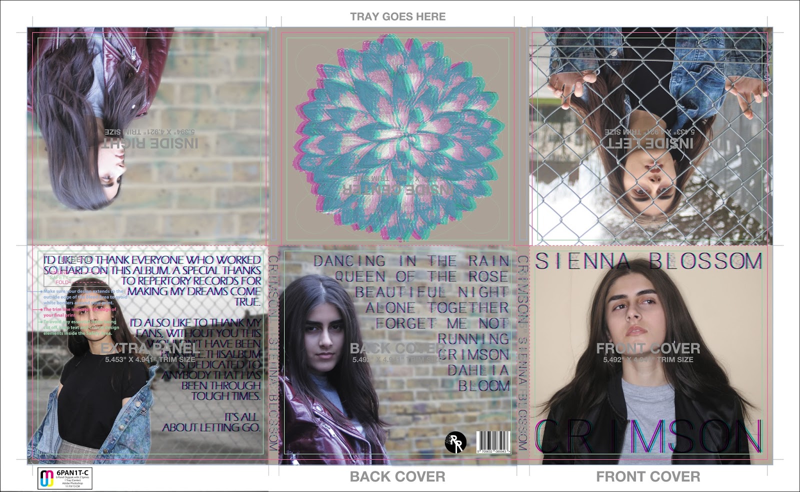
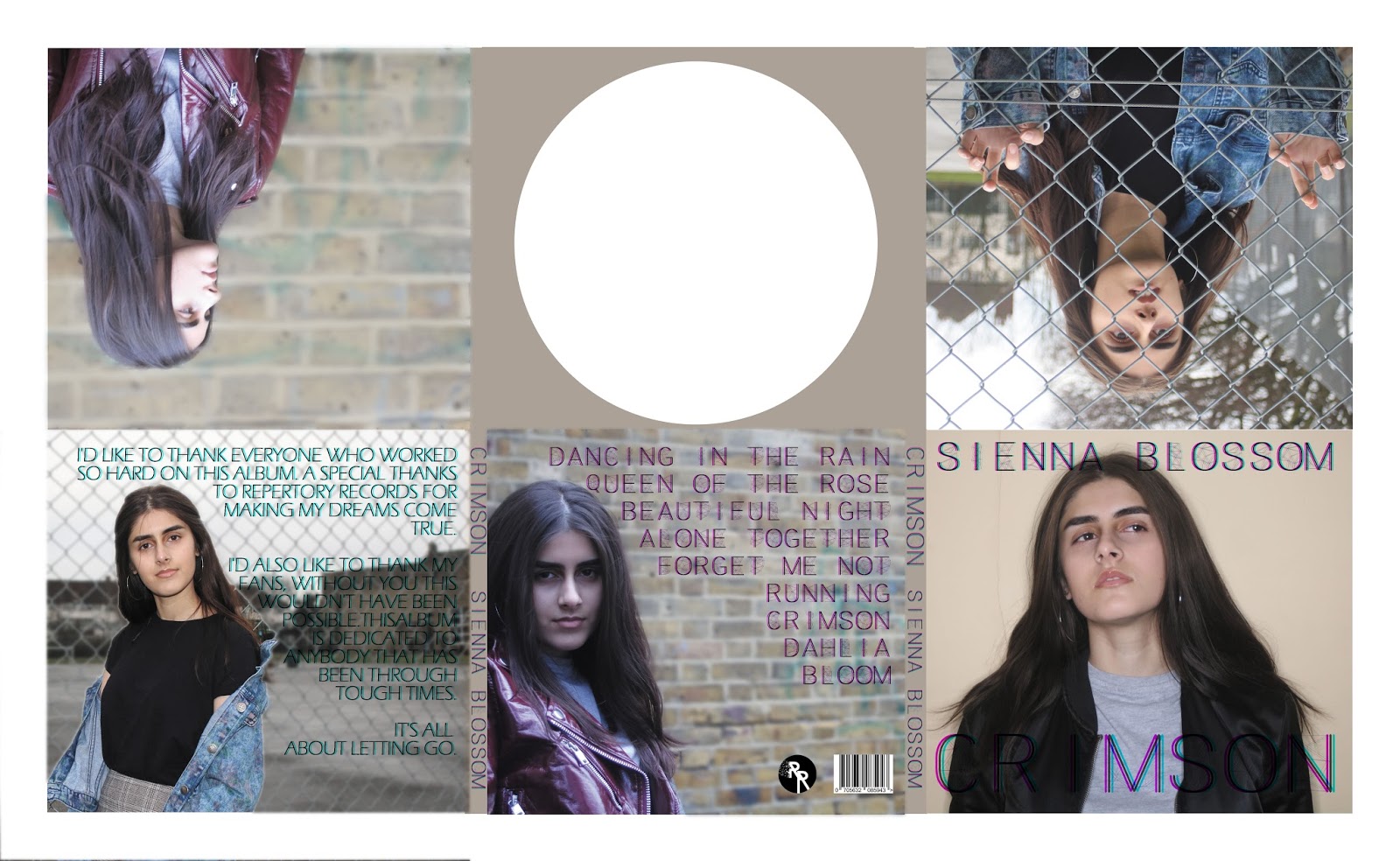
As a result of all the feedback I gained from my target audience, I was able to effectively produce an eye-catching, appealing and pop music genre album poster. This poster features the conventional aspects of an album poster such as the name of the album, the name of the artist and the release date. It also includes the artists website and the record company. My album poster also includes the branding that is present throughout all three products: the geometric font and the 'twitch' effect with the colours cyan and magenta.

Digipak Draft 4


Ancillary Draft 2 Feedback
Based on this feedback for both my ancillary products I will make the appropriate changes to please my target audience but also to enhance my products and make them look more like they are for the 'POP' genre.
Digipak changes that I will make:
Digipak changes that I will make:
- Use a range of photography rather than just using the brick wall background.
- Change the font colour to the whole twitch effect for all the text rather than just on the front cover.
- Add more colour to the CD panel by adding the branding of the twitched flower.
Album poster change I will make:
- Add the twitch effect to add branding and colour.
- Use a different image that is clearer and in focus.
- Emphasise the bottom panel text to make it more appealing.
Album Poster Draft 2
Based on feedback I received from my target audience, I made changes to make the image clearer as well as the text at the bottom

Digipak Draft 2
Based on feedback I received, I made changes to my digipak. I also added our brand (the twitch effect) to some of the copy of our text.


Friday, 9 February 2018


Colour Cut
Based on feedback that was received by our target audience, we decided to adapt some of our footage and our video. Here we colour graded our video to balance all the clips and also to add the cold atmosphere that would change the mood of our music video. This also made our music video seem more professional.
Running - Colour Cut from Repertory Records on Vimeo.
Running - Colour Cut from Repertory Records on Vimeo.
Thursday, 8 February 2018

Subscribe to:
Comments (Atom)